��Դ:uimaker.com ����:ui������
It is much easier to criticize somebody else’s work than to create something cool yourself. But if you apply a systematic approach to criticizing, make a numbered list and prepare illustrations, it will be regarded as a fully-fledged analysis! In my opinion, icon design is undergoing a transitional period. On the one hand, screen resolutions are increasing, hence enhancing icons. On the other hand, we still have good old pixels. Icons sized 16×16 and even smaller are still widely used. And so, here are the most commonly observed mistakes in icon design… Denis Kortunov ���ڷ�����һƪ���£���ϸ��������ͼ�������������10�ִ��� 1. ͼ��֮��û�����ԵIJ��컯��̫���ƣ����Ա�ʶ���� 2. ��һ��ͼ���������̫���Ԫ�أ�windows vista��ͼ���Ƿ���̲ģ��� 3. ���벻��Ҫ��Ԫ�أ� 4. һ��ͼ���е�ͼ��ͳһ�Բ��㣨��ɫ���⣬�ӽǶȣ��ߴ磬��ͼ�����ȣ��� 5. ��Сͼ���У�24X24���£�ʹ�ò���Ҫ���Ӻ���Ӱ�� 6. ����ԭ��ʹ���岻��ȷ�����罫����վ��Ƴ���ֽ������ʽ���� 7. ����������Ļ�����û�б����ǽ�����У� 8. ��ͼ����ʹ�ô����滯��Ԫ�أ����緺�ĵ�mac aquaЧ�����û�����Ϊ��IJ�Ʒ��ƻ���IJ�Ʒ�� 9. ��ͼ���ڲ�ʹ�����֣��ر��Dz����ױ�ʶ�ģ��� 10. ͼ���ⲿ��Եû�������ػ������� Sometimes within one set of icons, we have icons that look alike and it is very hard to understand what is what. If you miss the legends, you can very easily get the icons mixed up. The simpler and more laconic the icon, the better. It is preferable to keep the number of objects in a single icon to a minimum. Nevertheless, Microsoft’s designers, inspired by the new format of icons featured in Windows Vista, decided to go big and drew bloated icons to justify their bloated budget: An icon should be easy to read. The fewer elements it has, the better. It is better if the whole image is relevant and not only part of it. Therefore, you have to pay attention to the context of using icons. Let us take for instance some database icons: But if this application (or a separate toolbar) deals only with databases, we can (and should) remove the unnecessary part: Here is a real-life example of unnecessary elements occurring in BeOS 5 icons: It is a unity of style that unites several icons into a set. The uniting property can be any of the following: color scheme, perspective, size, drawing technique or a combination of several such properties. If there are only a few icons in the set, the designer can keep some rules in his head. If there are many icons in the set and there are several designers working on them (for instance, icons for an operating system), then special instructions are created. Such instructions describe in detail how to draw an icon so that it fits straight into the set. Progress does not stand still: interfaces have gained the potential to display semi-transparent objects, lost the limitation on the number of colors and there is now a trend towards 3D icons. But is it really all that useful? Not always! Especially if we are talking about icons sized 16×16 or smaller. For example, let us take the application manager from GNOME 2.2.0 (RedHat 9):
Denis Kortunov ���ڷ�����һƪ���£���ϸ��������ͼ�������������10�ִ���
#1 Insufficient differentiation between icons
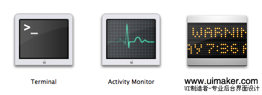
Icons from the Utilities section in Mac OS X. I am always getting them confused and launching the wrong application.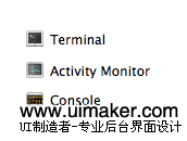 The problem is aggravated by having small size icons displayed on screen.
#2 Too many elements in one icon
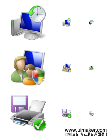 Each icon presents us with a mini-story with an intertwined plot. The problem is that in small size you are unable to work out what is depicted. Even in larger sizes, it is not always that easy to decipher the icons.
#3 Unnecessary elements
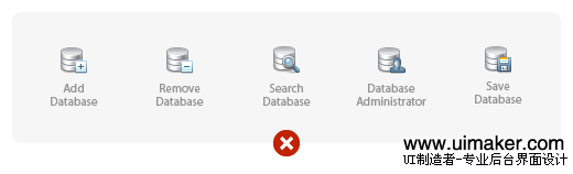
At first glance everything looks alright.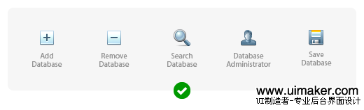
The sense is not lost here but the icons become much more discernible.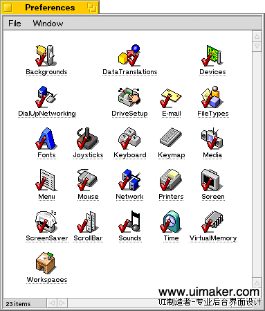
Ticks here are absolutely superfluous. By the way, why are they done in red?
#4 Lack of unity of style within a set of icons
 A multitude of styles in the shell32.dll file in Windows XP. This is the default set of icons suggested to a user wishing to change an icon.
#5 Unnecessary perspective and shadows in small icons
Copyright © 2008-2020 uimaker.com / ��ICP��09003079��-1