来源:uimaker.com 作者:sun_x
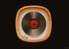
2008年末启动的一个项目,这次是部分单纯icon展示,全部采用AI cs4,基本没有在ps做任何修改。
The end of 2008 started a project, this is the part of a simple icon display, all with AI cs4, basically did not make any changes in ps. 图标要求为美观与易懂兼容,所以不使用过多高光与多余修饰,同时一屏显示15个图标,简化后看起来也不会很累。 Icons requirements for aesthetic compatibility with easy to understand, so do not use too many high-light and excessive grooming, while a 15-screen display icon, and simplified it does not look tired. 心得:基本掌握了AI绘制图标的优劣,以后会一直保持使用,在一屏同时绘制多个图标时,感觉比PS强悍不少。 Experience: basic grasp of the pros and cons of AI draw icons, will always retain the use of the future, in a screen at the same time draw the number of icons, powerful feel a lot more than PS. 细节方面除各类纹理不如ps外,其他基本能满足各种苛刻绘制要求,放大显示和输出方面无可挑剔,建议我的longcheer的同事们也可以改变下,对于各类屏幕尺寸高质量输出,AI太适合了。 In addition to various types of texture detail than ps, the other basic requirements to meet a variety of harsh rendering, zoom display and output in impeccable, it is recommended longcheer of my colleagues can also be changed, the screen size for the various types of high-quality output, AI too much for the. google页面翻译 上菜 
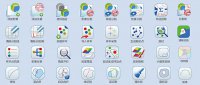
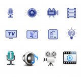
图标设计

图标设计